 Responsive Miracle
What are the best examples of beautiful Drupal sites?
LACMA and Visit NSW lead on visuals, while Novartis, Red Hat and Mars show how a big brand can look simple. UNICEF and Doctors Without Borders pair strong photos with clear Donate buttons, and Cambridge, Georgia.gov and Pantheon prove useful pages can look good too. We checked all 14 home pages for Drupal signals on 30 October 2026.
Best for: designers, site owners and Drupal teams looking for real design examples
What do beautiful Drupal sites have in common? They treat Drupal as the engine and let photos, type and clear menus do the talking. We picked 14 of the best Drupal websites from museums, tourism, business, charities, universities and government. Then we checked each home page on 30 October 2026, so every example below still shows a Drupal signal today.
Most lists of Drupal website examples are old, and some of their famous names have moved on. So we start with the test we used. After that come the sites, grouped by type, with one design idea to borrow from each.
How we checked these Drupal website examples
First, we loaded each home page and read its code. A Drupal site usually leaves a trace: a generator tag such as “Drupal 11”, an X-Drupal cache header, or data-drupal attributes in the HTML. Every site here shows at least one of those. However, a big organization can use another tool on some sections, so this test covers the home page only.
The same test also removed well-known names. For example, NASA.gov now reports WordPress, Grammy.com shows a WordPress image plugin in its generator tag, and Visit California reports Gatsby on the front end. Tesla, Princeton and Mass.gov blocked our automated check, so we left them out rather than guess.
Museums and tourism: the most beautiful Drupal sites
Culture and travel brands have the best raw material, so these pages lean on big images.
LACMA
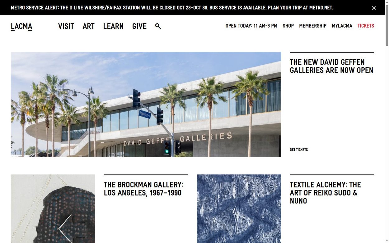
The Los Angeles County Museum of Art runs on Drupal 11, and its home page reads like a printed magazine. Bold condensed headings sit beside photos in a tight grid, with thin rules between stories. Opening hours stay in the top bar, so visitors find the practical facts at once.
Borrow this: one strong typeface and a strict grid can carry a whole site.
Visit NSW
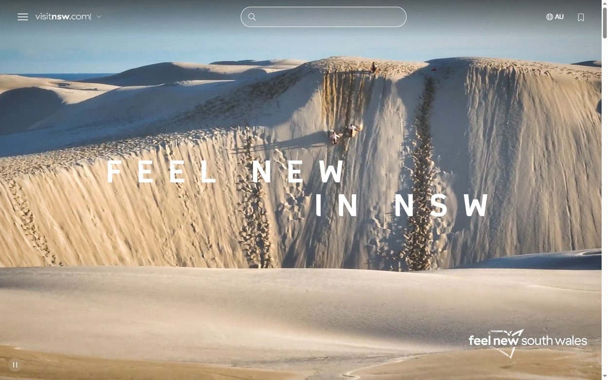
Visit NSW, the official tourism site for New South Wales, also uses Drupal 11. A full screen landscape fills the first view, with only a short “Feel new in NSW” line on top. The menu shrinks to a small icon, so nothing competes with the view.
Borrow this: when the picture sells the product, remove almost everything else.
Best Drupal websites from global brands
Next come companies with large product ranges. Their challenge is to look simple while hiding thousands of pages.
Novartis
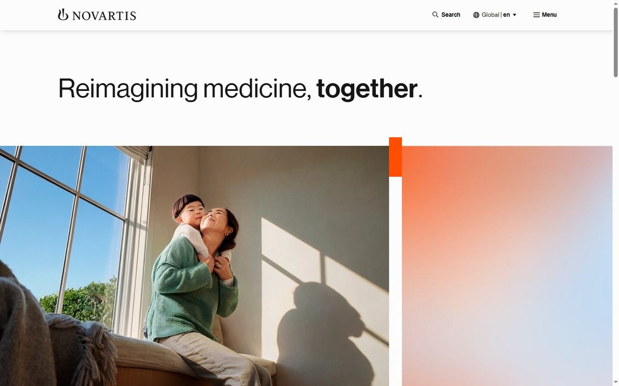
Novartis opens with a single sentence, “Reimagining medicine, together”, on a white page. Below it, a warm family photo meets a soft orange gradient. For a pharmaceutical company, that calm and human tone is a smart choice.
Borrow this: white space makes a serious message feel confident.
Red Hat
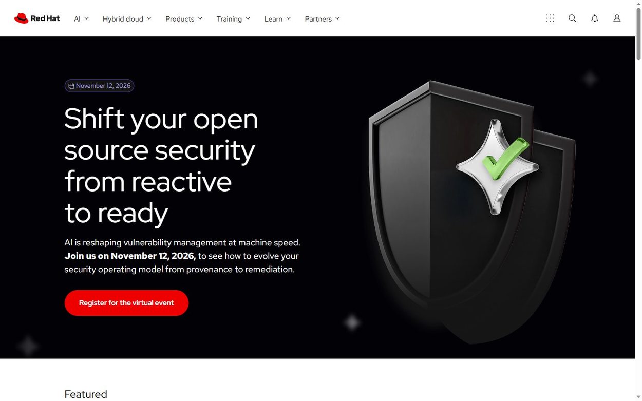
Red Hat shows that a Drupal 10 site can look like a modern software brand. A black hero, large light type and one red button keep the focus on a single action. In addition, the navigation stays quiet, even though the company sells many products.
Borrow this: use your brand color only for the button you want clicked.
Nokia
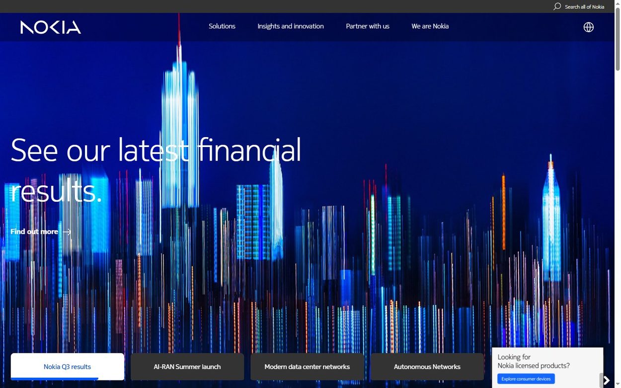
Nokia uses a deep blue digital skyline as its stage. A row of shortcut cards along the bottom of the first view leads to results, events and network topics. So visitors get mood and direct paths on one screen. The site reports Drupal 10.
Borrow this: add a shortcut row under the hero for your busiest pages.
Mars
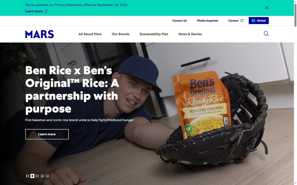
Mars runs on Drupal 11 and fills its home page with campaign stories, not corporate slogans. Heavy white headlines sit on bright photos, and the small menu stays out of the way. As a result, a company with many brands feels friendly and current.
Borrow this: lead with a story people care about, not with your org chart.
Beautiful Drupal sites for charities
Charities need emotion and clear action in the same view. These two examples do both.
UNICEF
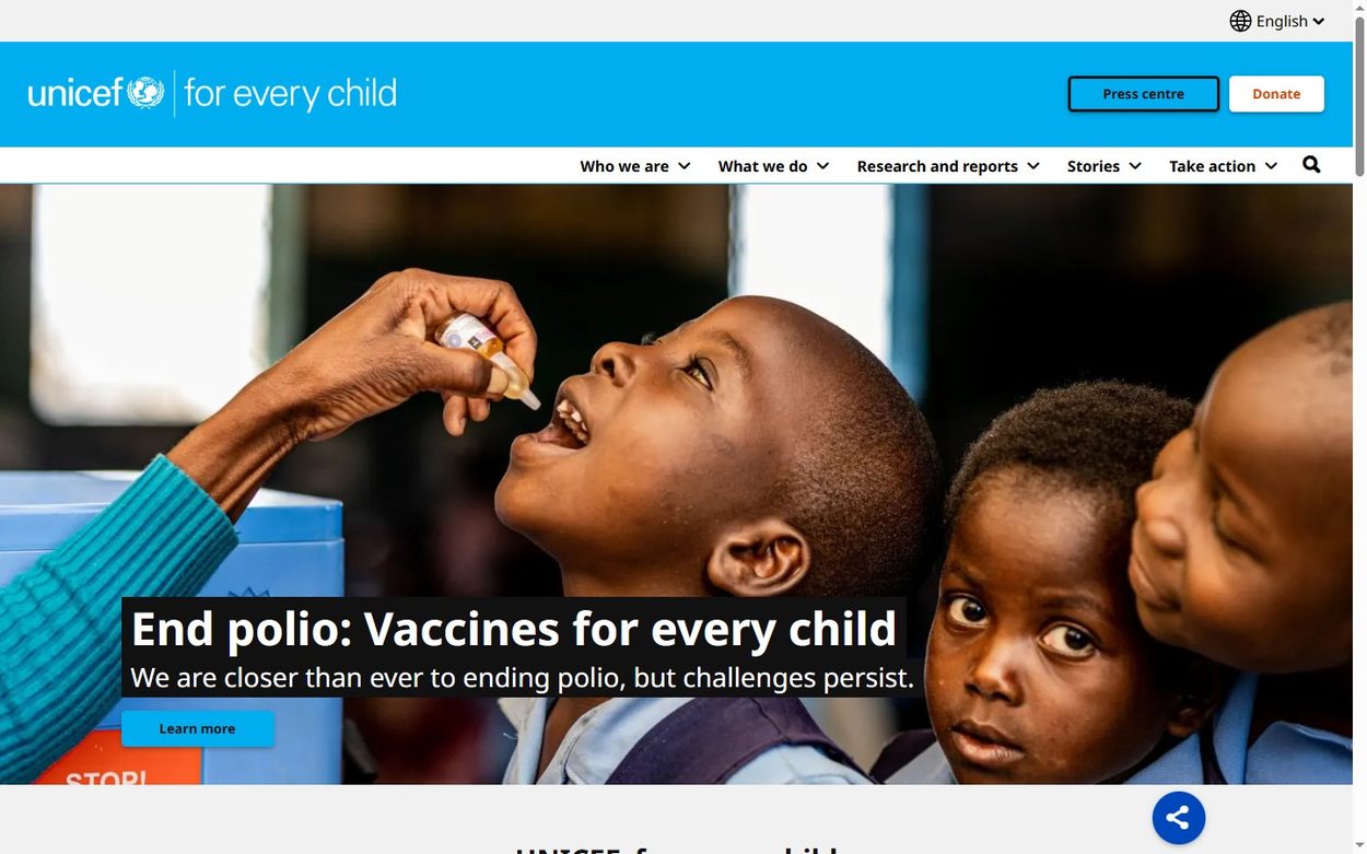
UNICEF keeps its famous cyan band at the top, then gives the rest of the view to one photo and one headline. The Donate button stays visible in the header. Meanwhile, the large menu groups a huge library of reports into four or five labels.
Borrow this: keep the main action in the header on every page.
Doctors Without Borders
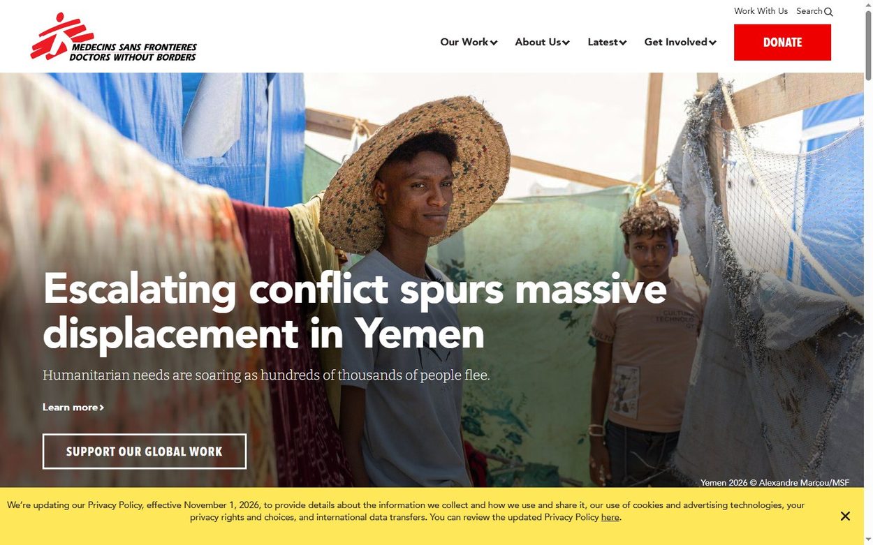
The US site for Doctors Without Borders runs on Drupal 11. Documentary photography fills the screen, while a serif subhead gives the page the feel of a news report. Only one element is bright red: the Donate button.
Borrow this: real photos beat stock images when trust matters.
Drupal website design in higher education
Universities are among the heaviest Drupal users, because they run thousands of pages for many audiences.
University of Cambridge
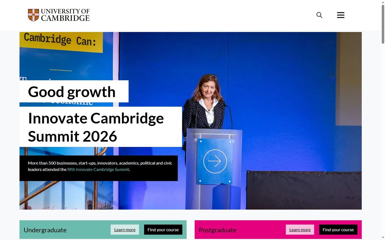
The University of Cambridge reports Drupal 10. Its home page frames one news story, then places two colored blocks for undergraduate and postgraduate study right below. So the two biggest audiences find their path at once.
Borrow this: give each main audience its own colored door.
University of Colorado Boulder
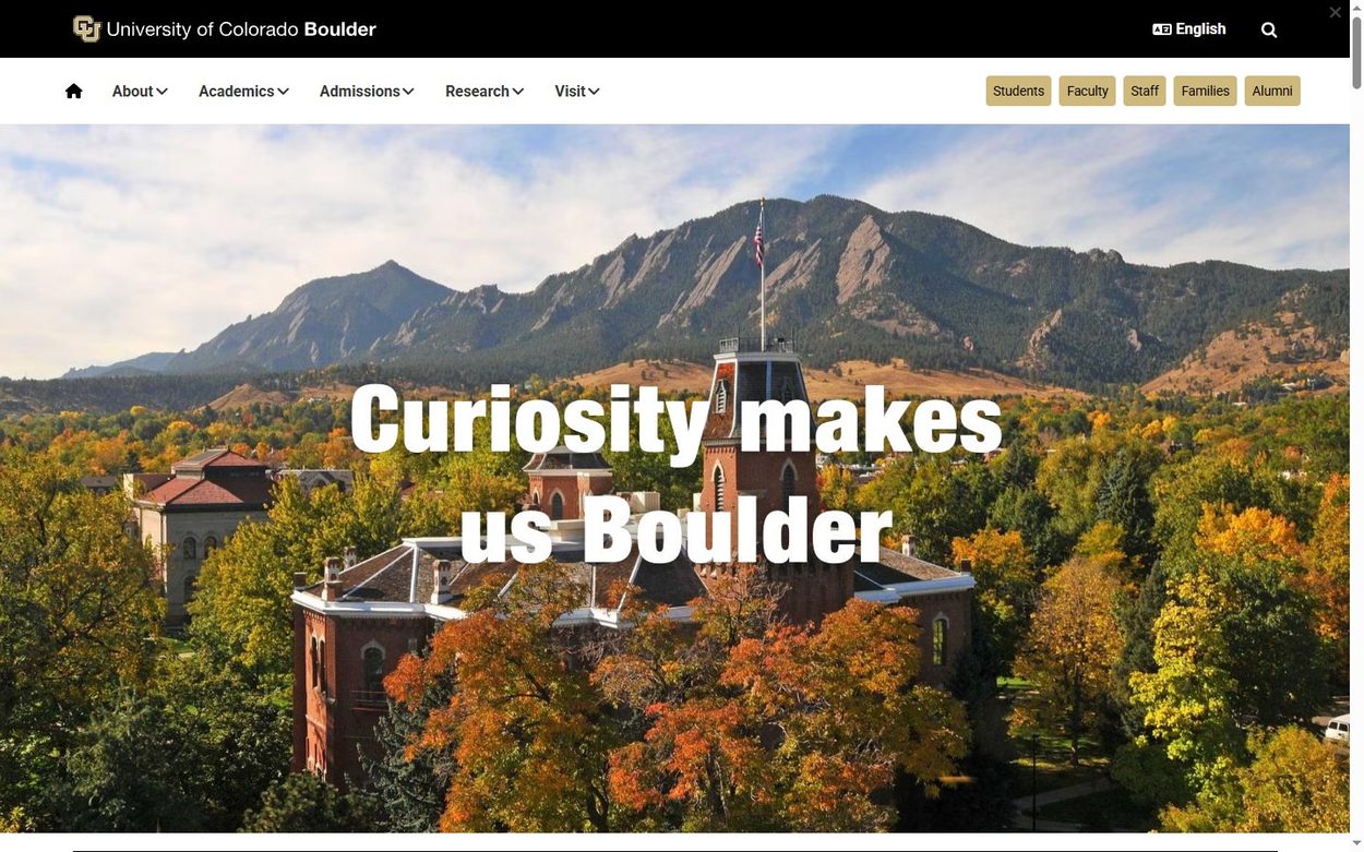
CU Boulder runs on Drupal 11 and uses its best asset: the Flatirons behind the campus. A large line, “Curiosity makes us Boulder”, plays on the name. Small audience buttons for students, faculty and alumni stay at the top.
Borrow this: a place can be your hero image if it is truly yours.
Tufts University
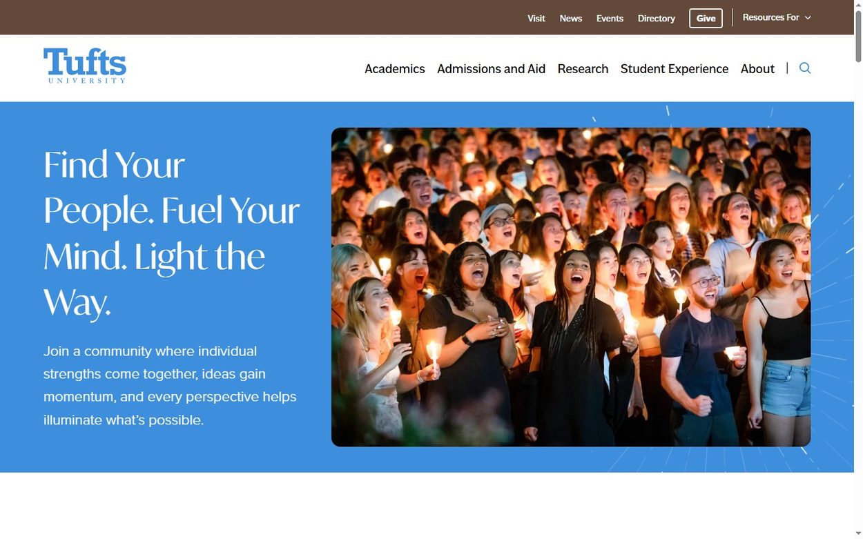
Tufts University reports Drupal 10. A flat blue panel holds a large serif headline, and a rounded photo sits beside it. Because the layout is so simple, the color and the type do all the work.
Borrow this: one flat brand color can replace a busy hero.
Brown University
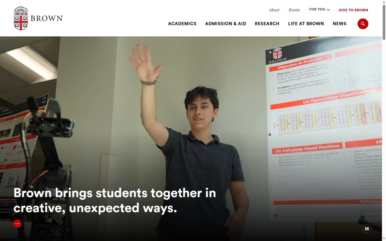
Brown University shows a Drupal cache header and opens with a full width photo of a student. One short white line sits at the lower left, so the person stays the subject. Above it, the crest and a slim menu give the page a formal, quiet frame.
Borrow this: place text in a corner so faces stay visible.
Popular Drupal websites in government and tech
Finally, two sites show that useful pages can still look good.
Georgia.gov
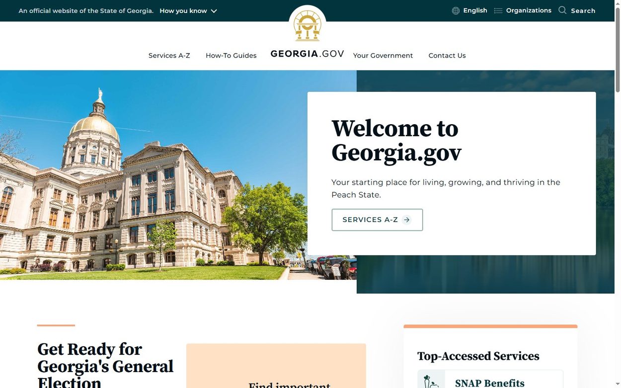
Georgia.gov reports Drupal 10 and proves that a government site need not feel cold. A photo of the capitol shares the first view with a clean welcome card and a Services A-Z button. Below it, the top services sit in a plain list.
Borrow this: put the most requested tasks directly on the home page.
Pantheon
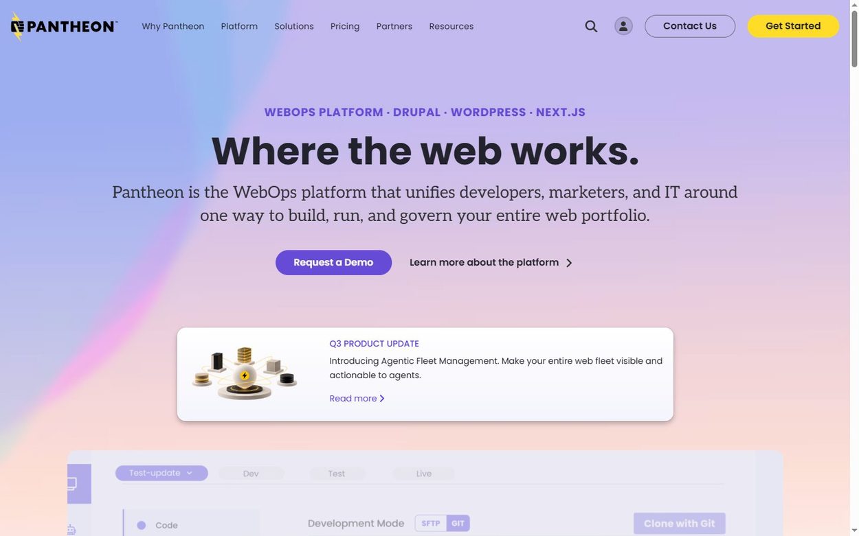
Pantheon hosts Drupal and WordPress sites, and its own site runs on Drupal 11. A soft purple gradient and a short “Where the web works” headline give it the look of a modern SaaS page. That is a useful reminder, because Drupal does not have to look corporate.
Borrow this: a soft gradient and a short headline can modernize any layout.
How to build a beautiful Drupal site yourself
Most of the sites above are custom builds. Still, the same ideas work on a smaller budget. Start with one large image, one typeface and one accent color for your main button. Then keep the top menu to about five labels, and add a shortcut row for your busiest pages.
A good theme gets you most of the way. Our list of the best Drupal 11 themes covers current options, each checked against its Software Version field. For a wider choice, browse the full Drupal themes collection.
Frequently Asked Questions
What are some beautiful Drupal sites?
Strong examples include LACMA, Visit NSW, Novartis, Red Hat, UNICEF, the University of Cambridge and Pantheon. Each home page showed a Drupal signal on 30 October 2026.
What are the most popular Drupal sites?
Large organizations lead the list. UNICEF, Red Hat, Nokia, Mars, Novartis and Doctors Without Borders all showed Drupal signals on their home pages in our check.
How can I tell if a website uses Drupal?
View the page source and look for a generator tag such as “Drupal 11”, or for data-drupal attributes. The response headers may also include an X-Drupal cache line.
Is Drupal good for website design?
Yes. Drupal does not limit the design, because the theme controls the front end. The examples here range from a magazine layout at LACMA to a SaaS look at Pantheon.
Can I get this look with a Drupal theme?
You can get close. Pick a theme with a large hero, then limit yourself to one typeface and one accent color. Our Drupal 11 theme list is a good place to start.
